Work
A collection of my favorite works
Unik Design System is synthesizing the quintessence of design languages around the world. The core values that help the business owner find a good solution that meets the complexity of the product such as Adaptability, and Scalability. With the spirit of innovation, Unik aspires to create a powerful design system.
Here are the Principles that were formed to create delightful experiences for end-users.
Consistency reduces the cognitive load on users, allowing them to predict outcomes and navigate the interface more easily
Focus on reducing complexity by designing interfaces that are clean, straightforward, and easy to understand
Design with inclusivity in mind, ensuring that your product is usable by people of all abilities
Design token is familiar to UX Designer and Design System Builder with a variety of benefits:
![[object Object]](https://res.cloudinary.com/dcu1do3s8/image/upload/v1742543699/notion-media/186101d4-20fe-81a8-8480-d76ed53b4156.png)
Design tokens organized in a tree structure allow for easy modifications at any level of the hierarchy. This means that if a design system builder needs to change a specific node such as a color, font size, or spacing value. They can do so without affecting unrelated parts of the system.
![[object Object]](https://res.cloudinary.com/dcu1do3s8/image/upload/v1742543699/notion-media/186101d4-20fe-81af-8e59-db51179fb20f.png)
![[object Object],[object Object]](https://res.cloudinary.com/dcu1do3s8/image/upload/v1742543699/notion-media/186101d4-20fe-8109-832b-cdda8c6b5973.png)
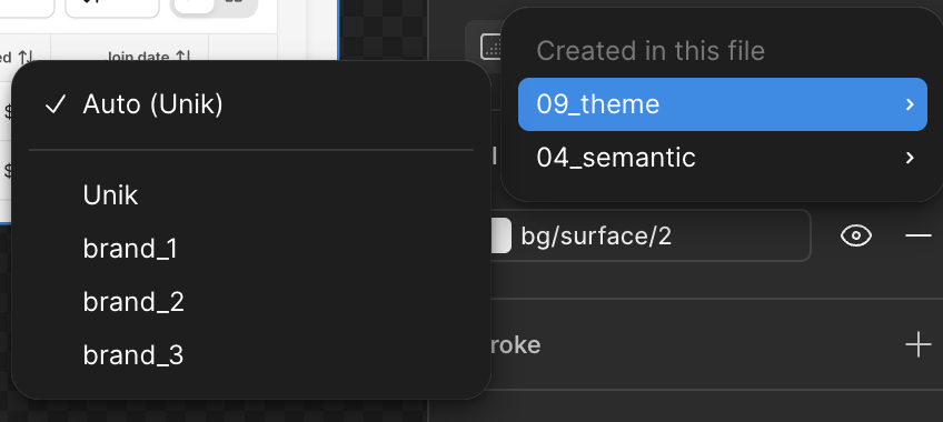
Design System library might contain many themes, and each theme will contain many styles. With this approach, we can easily switch the library with the Figma feature supported (Switch Library)
![[object Object]](https://res.cloudinary.com/dcu1do3s8/image/upload/v1742543699/notion-media/186101d4-20fe-81ba-875a-f204d74e6ab9.png)
After creating the Design token, I continued to define the Foundation such as Color, Typography, Dimension, and Elevation,…
The font I chose is the Inter family which is used by many products around the world. Here are the benefits you should overview it:
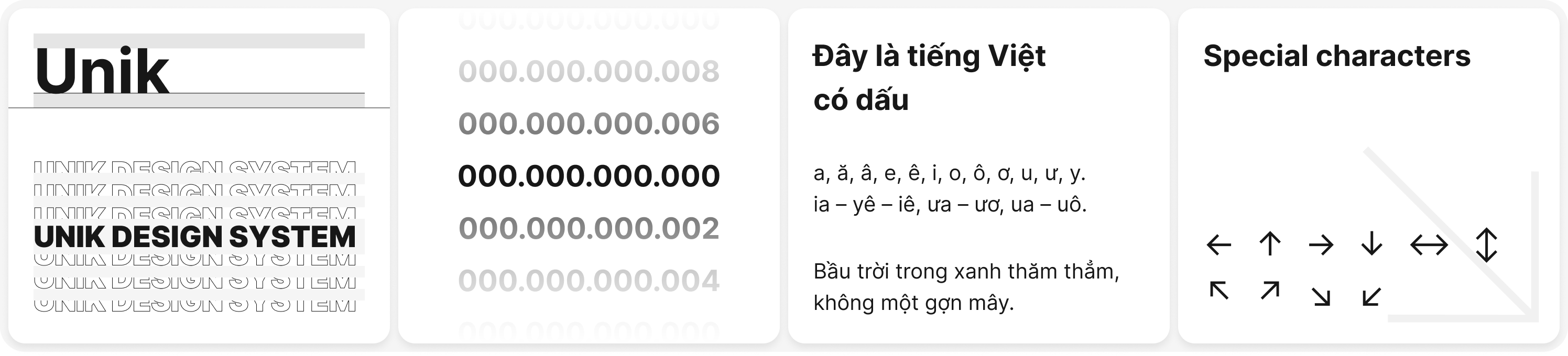
To reduce the time build, I used the color from Tailwindcss color. Because those benefits:
![[object Object]](https://res.cloudinary.com/dcu1do3s8/image/upload/v1742543699/notion-media/186101d4-20fe-818e-8386-eb5391e5ee2e.png)
![[object Object]](https://res.cloudinary.com/dcu1do3s8/image/upload/v1742543699/notion-media/186101d4-20fe-81fb-8720-f4982299308c.png)
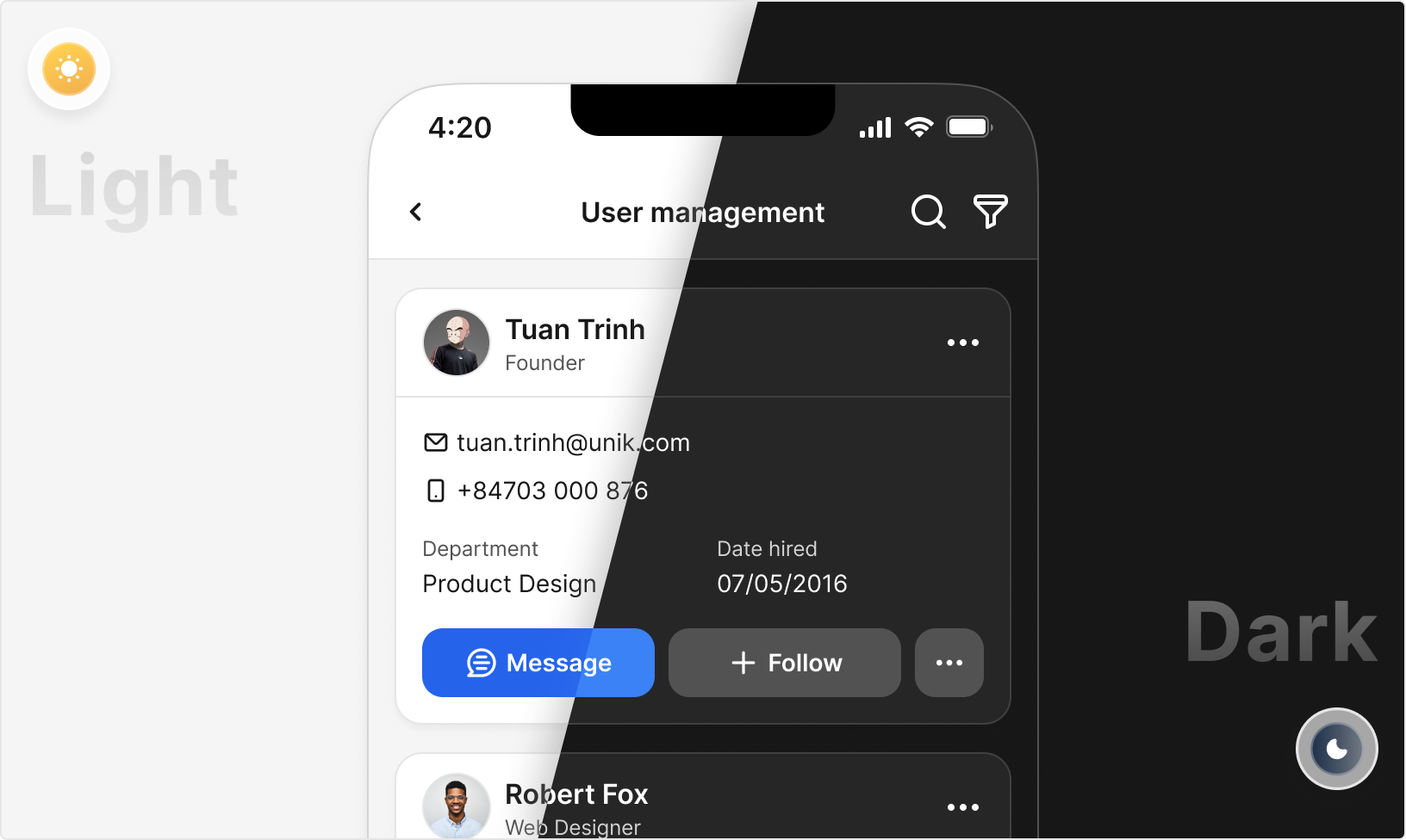
Surface is important in User Interface because it defines the visual layers, depth, and hierarchy of the elements in the interface, influencing how users perceive and interact with the content. Below is each layer that I defined
![[object Object]](https://res.cloudinary.com/dcu1do3s8/image/upload/v1742543699/notion-media/186101d4-20fe-81b7-b840-f47d320149e4.png)
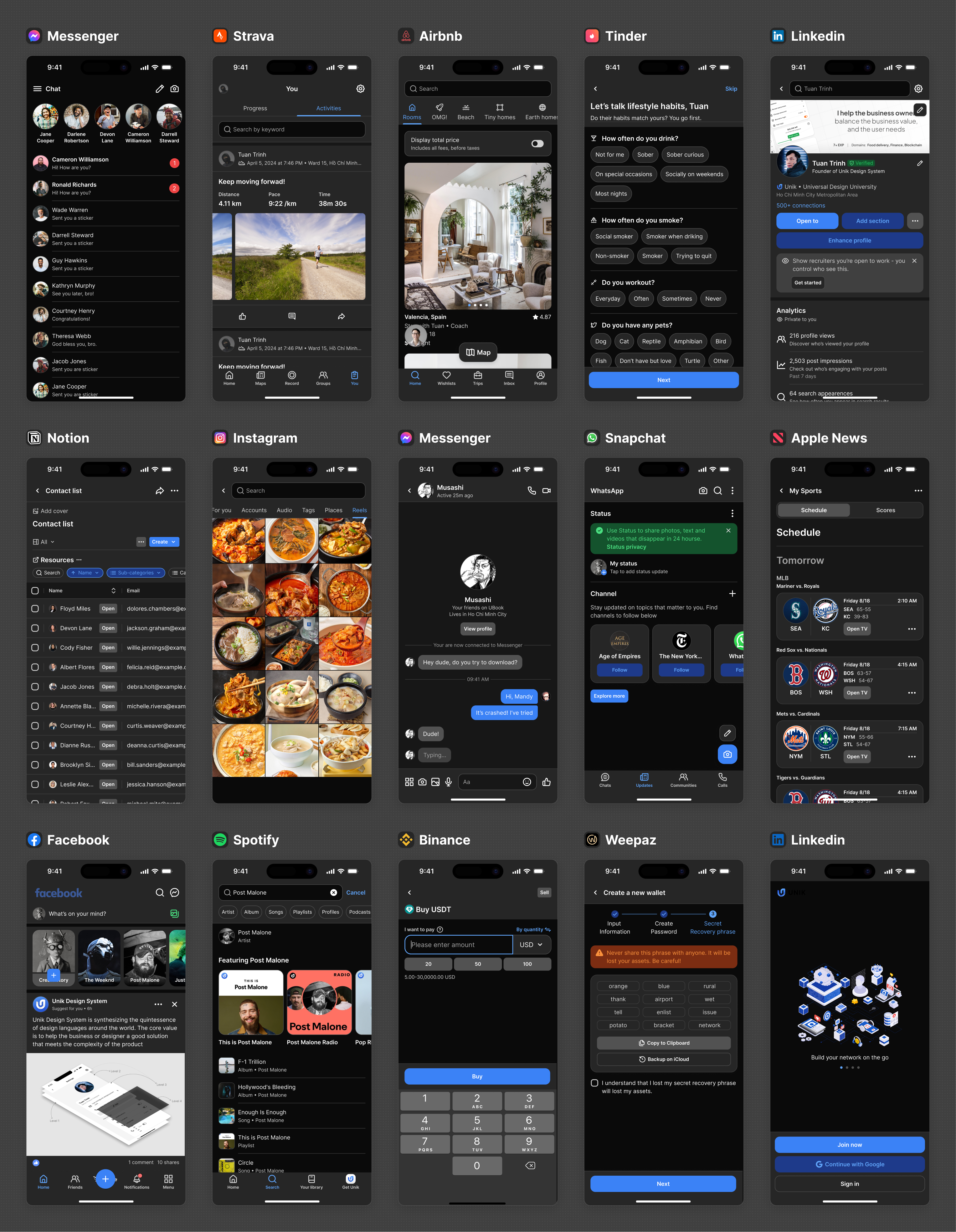
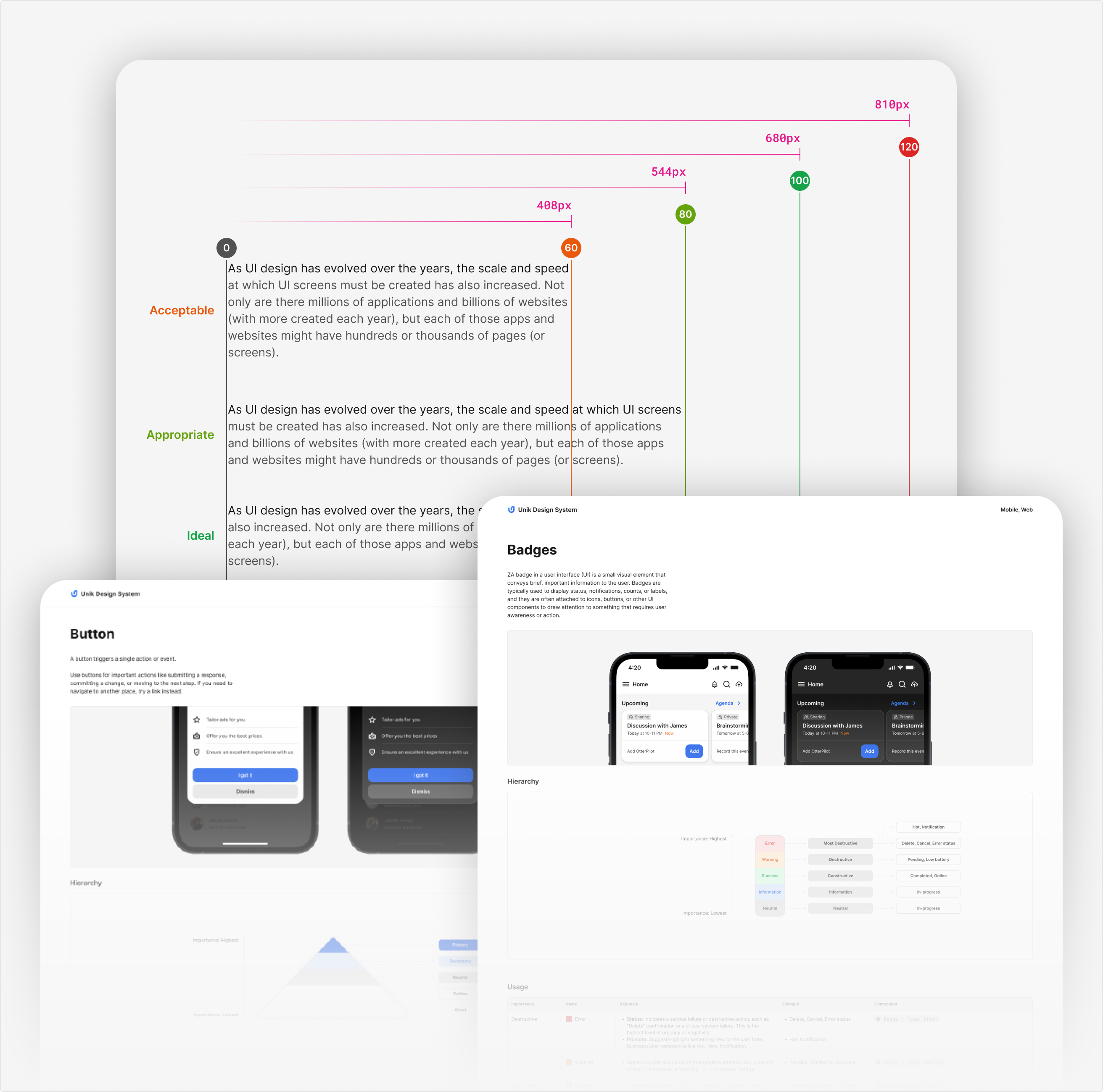
In addition to testing on the WCAG tool, to ensure the design can be used in real products, I have UI testing on many famous applications
![[object Object]](https://res.cloudinary.com/dcu1do3s8/image/upload/v1742543699/notion-media/186101d4-20fe-811a-bfd9-d4180adc45c7.png)
![[object Object]](https://res.cloudinary.com/dcu1do3s8/image/upload/v1742543699/notion-media/186101d4-20fe-818b-823a-fea214b510a7.png)
![[object Object]](https://res.cloudinary.com/dcu1do3s8/image/upload/v1742543699/notion-media/186101d4-20fe-81a3-91f6-dcf5bb78e40f.png)
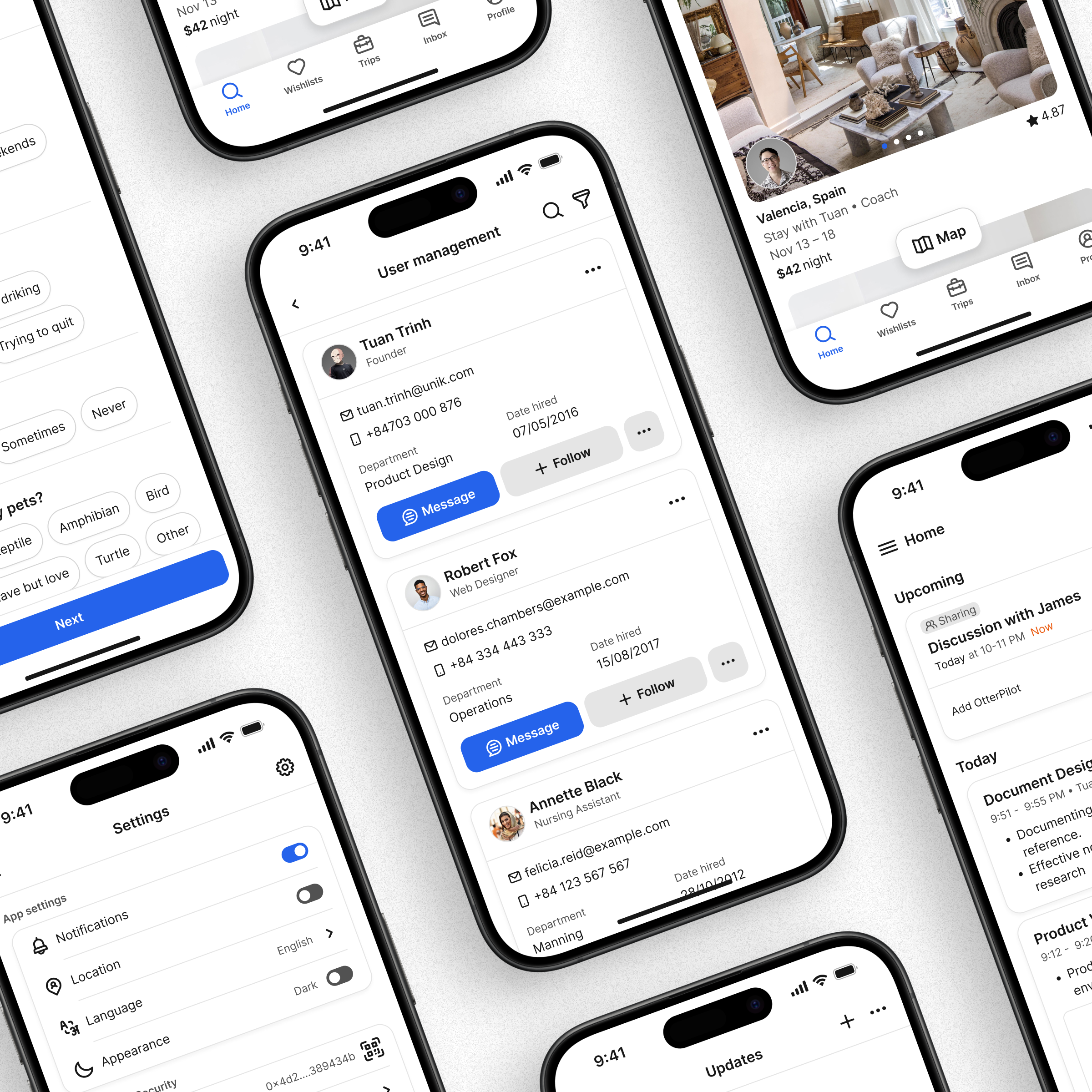
In my opinion, the Design System Language should be built for the user of the platform we are targeting. In this project, I am building a system that can serve a wide range of products and I do not determine the specific user at this phase. Hence, I based it on the UI of top applications in the market to testing
![[object Object]](https://res.cloudinary.com/dcu1do3s8/image/upload/v1742543699/notion-media/186101d4-20fe-810d-8633-f1b2e99bcf39.png)
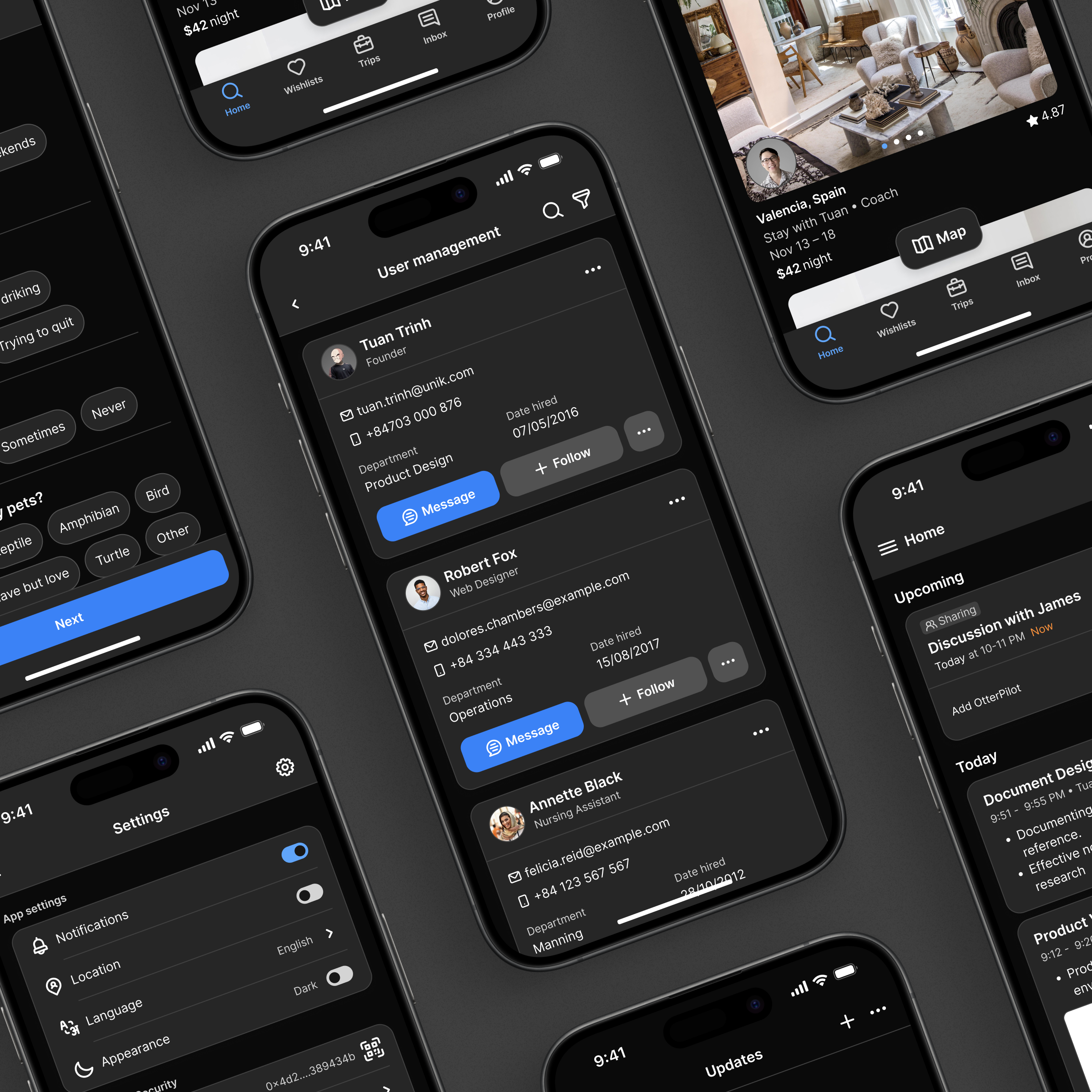
Dark mode is trending in the Design System Language which improves the user experience for those benefits:
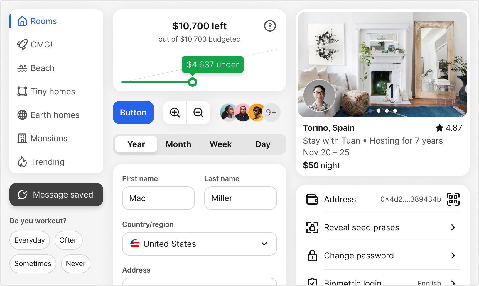
Besides, Unik Design System can adapt to the Web application
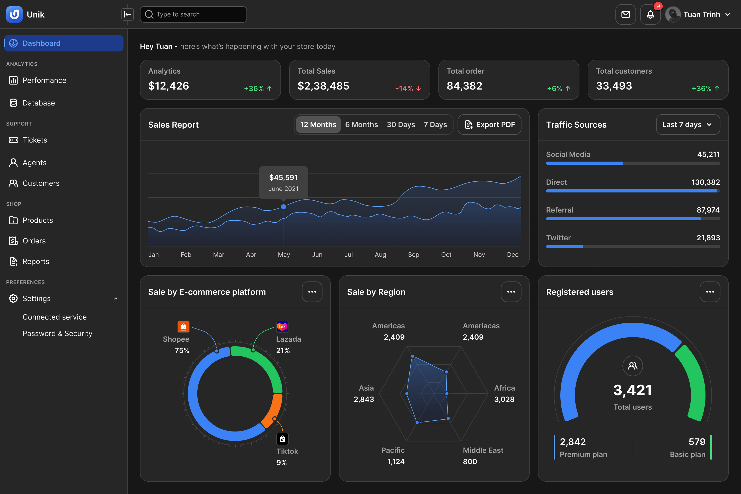
Have a good structure (Design Token), the visual interface looks well. Creating a component that is friendly to use every day for UX Designer is an important goal I have to achieve
![[object Object]](https://res.cloudinary.com/dcu1do3s8/image/upload/v1742543699/notion-media/186101d4-20fe-81c6-8ef1-d32c465db99c.png)
![[object Object]](https://res.cloudinary.com/dcu1do3s8/image/upload/v1742543700/notion-media/186101d4-20fe-814d-9285-e28f7aade6a3.png)
![[object Object]](https://res.cloudinary.com/dcu1do3s8/image/upload/v1742543701/notion-media/186101d4-20fe-8128-85a0-fb00536bd799.png)
Imagine you have many products in one ecosystem, your mission is to own a bunch of components to ensure consistency, and maintain the modifications.
With the mode collection, it reduces the cost a lot instead of the traditional way (which is managing many design systems). Just a few clicks in Figma, your product switches to a new UI with its styles (Typography, Brand color,…). Amazing, right!
The video below demonstrates how it works
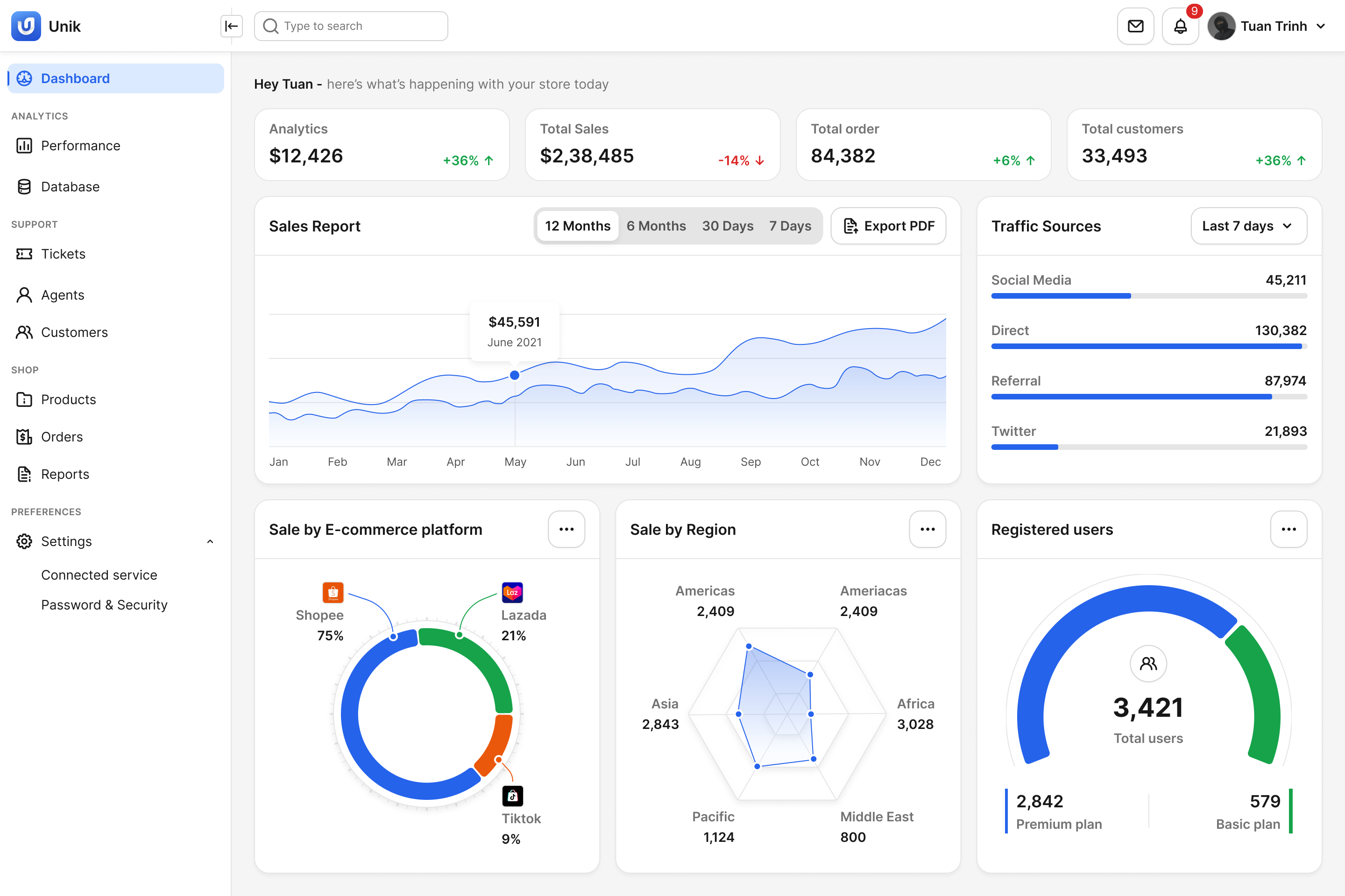
The product was applied Unik Design System to build the UI:
To ensure every stakeholder such as the Designer and developer,… understands the fundamental, usage of every component in the Design Language. Documenting the guidelines is essential for the team.
“Rome wasn't built in a day” — Building a design system is not easy, it requires continuous improvement, user behavior research, and solving user problems when using the application. All approaches in this case study may not be completely done and need to be enhanced more in the future. I hope the content of this will benefit you. Thank you for reading.