
Power of concise
October 24, 2025
I still remember the lesson that my first leader taught me, he said: “No one pays attention to your lengthy document, even though it’s adequate, and detailing”. It enlighten me from that time from now.
We tend to feel stressed when reading a bunch of texts
My leader was a Product Manager, he used to write the product requirements document (PRD) for the team. For a while, he realized a few people in the team had read the document carefully, and they just focused on some pictures or diagrams in the document. Reflect on myself, I am also a person who prefers to read the image instead of a bunch of texts — maybe that's why I became a designer :D
![[object Object]](https://media3.giphy.com/media/v1.Y2lkPTc5NDFmZGM2MzY1ZWY4ODh3c3FxYTRicW5wZGE4cTdvYXFheWw1OTZxbWg2amJleiZlcD12MV9naWZzX3NlYXJjaCZjdD1n/FrqU6wyZWRUQqpISRt/giphy.gif)
Do you want to read this “academic” document?
Concise, but still adequate
Got that insight, he tries to create another version that summarizes all the key things into one diagram. Besides, the full version is still available when the team needs to read it when needed.
![[object Object]](https://res.cloudinary.com/dcu1do3s8/image/upload/v1761375674/notion-media/296101d4-20fe-8035-9b9c-eeb894bdee45.png)
This is not the actual image of him demonstrate image, just a demo for you to get the idea.
After testing, he recognized that the missing implementation features of the team were reduced effectively, and the bugs appeared less than before testing.
💡
From a UX designer's perspective, here's a good UX that addresses the user's (in this case, the development team's) pain point:
- Reduce the cognitive load
- Grab the attention of the audience
By the way, here is my favorite UX post on the same topic that I like. Less is more
💡
UX is everywhere around us, just like the phrase every UX designer has heard before - UX in everyday life (a book on UX by Don Norman)
This lesson has changed the way I communicate, or explain some complex information to my team to this day.
Here's what I did recently to break down complex information into just 2 slides by summarizing the key ideas and illustrations instead of writing it into many slides.
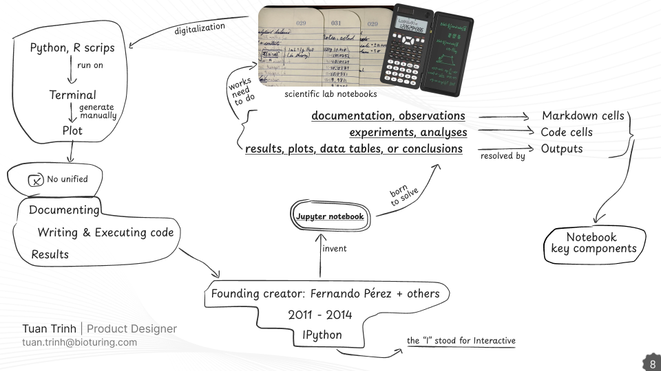
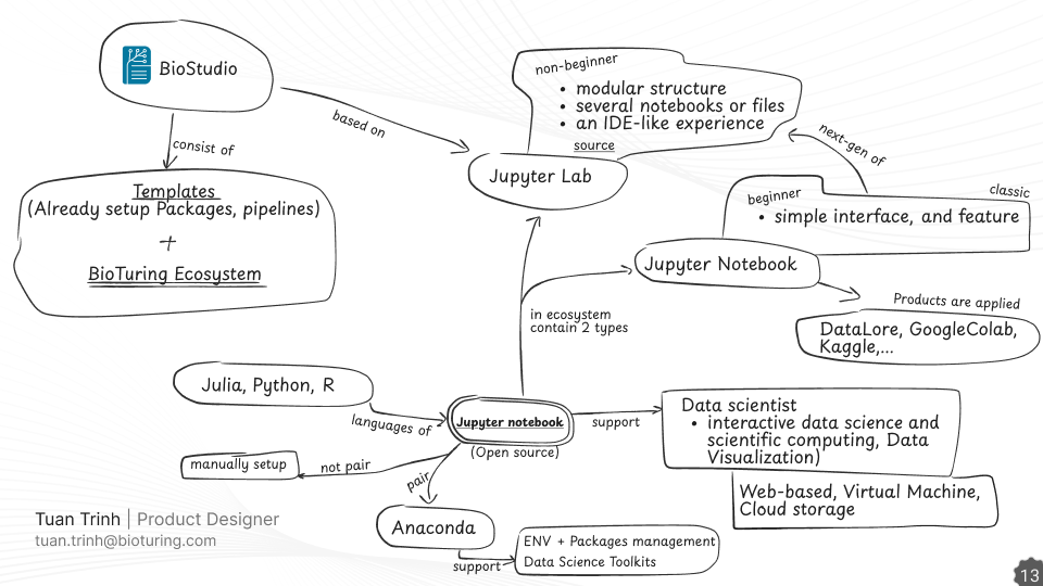
and the text version looks like this

So, which version do you prefer?
Other references
In addition to that study, I also apply illustration techniques to make the presentation more vivid. You can have a reference of it: